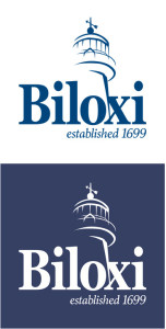
 The City of Biloxi will be rolling out a fresh new logo over the next several weeks.
The new logo uses the city’s signature landmark, the iconic Biloxi Lighthouse, stylized in a modern interpretation with a bold, readable font proclaiming “Biloxi,” with an underline that accentuates the city’s rich history, “established 1699.”
Mayor Andrew “FoFo” Gilich approached his cousin, John Seymour, art director at The Prime Time Agency, to create the logo. Seymour, who has served as Prime Time’s creative director for 25 years, also designed the iconic “I am Biloxi” artwork for Gilich’s mayoral campaign.
“That ‘I am Biloxi’ campaign resonated with people who live in and love Biloxi,” Gilich said. “In fact, we’re going to be selling ‘I am Biloxi’ T-shirts in the Biloxi Visitors Center soon, with a plan to use the money for beautification projects.
“This new branding for the city, the city logo, capitalizes on that. It’s fresh, it’s bold, it’s stylish and it’s ‘Biloxi.'”
The new logo design, which was funded personally by Gilich, will begin appearing on all city stationary, city publications, city vehicles and other city property. It replaces a logo that was created more than 20 years ago.
The logo uses a Georgia Bold font for the word “Biloxi,” with a Marion Italic underline that says “established 1699.” When in color, the logo uses a PMS 295 true “Biloxi Blue” color.
Said Gilich: “We’re working with the city’s longtime advertising agency, The Ad Group, to make sure that we have consistent branding, and that we raise awareness about the many exciting opportunities here in Biloxi.”


